
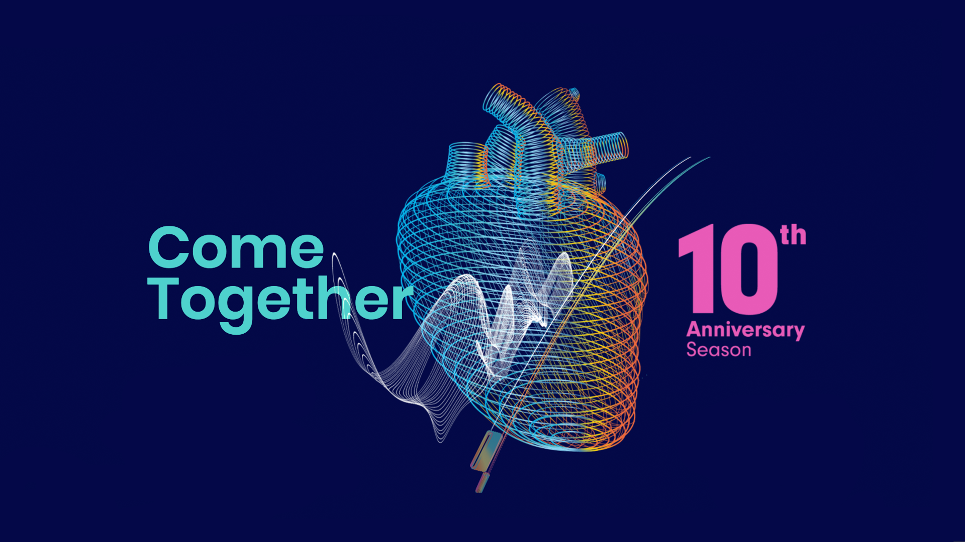
The Blueridge Chamber Music Festival offers innovative programming, dazzling artists, engaging lectures and masterclasses, and unforgettable performances in a relaxed summer setting. They needed a brand identity, a website, and promotional materials for various campaigns.
The festival's new website should allow users to get tickets, donate, and register for their chamber music workshop.
The festival's new website should allow users to get tickets, donate, and register for their chamber music workshop.
Credits
Art Direction and Branding: Diana Castaneda
Illustration: Lillian T. Zhang
Graphic Design: Diana Castaneda, Lillian T. Zhang
Interaction and Product Design: Diana Castaneda
Art Direction and Branding: Diana Castaneda
Illustration: Lillian T. Zhang
Graphic Design: Diana Castaneda, Lillian T. Zhang
Interaction and Product Design: Diana Castaneda
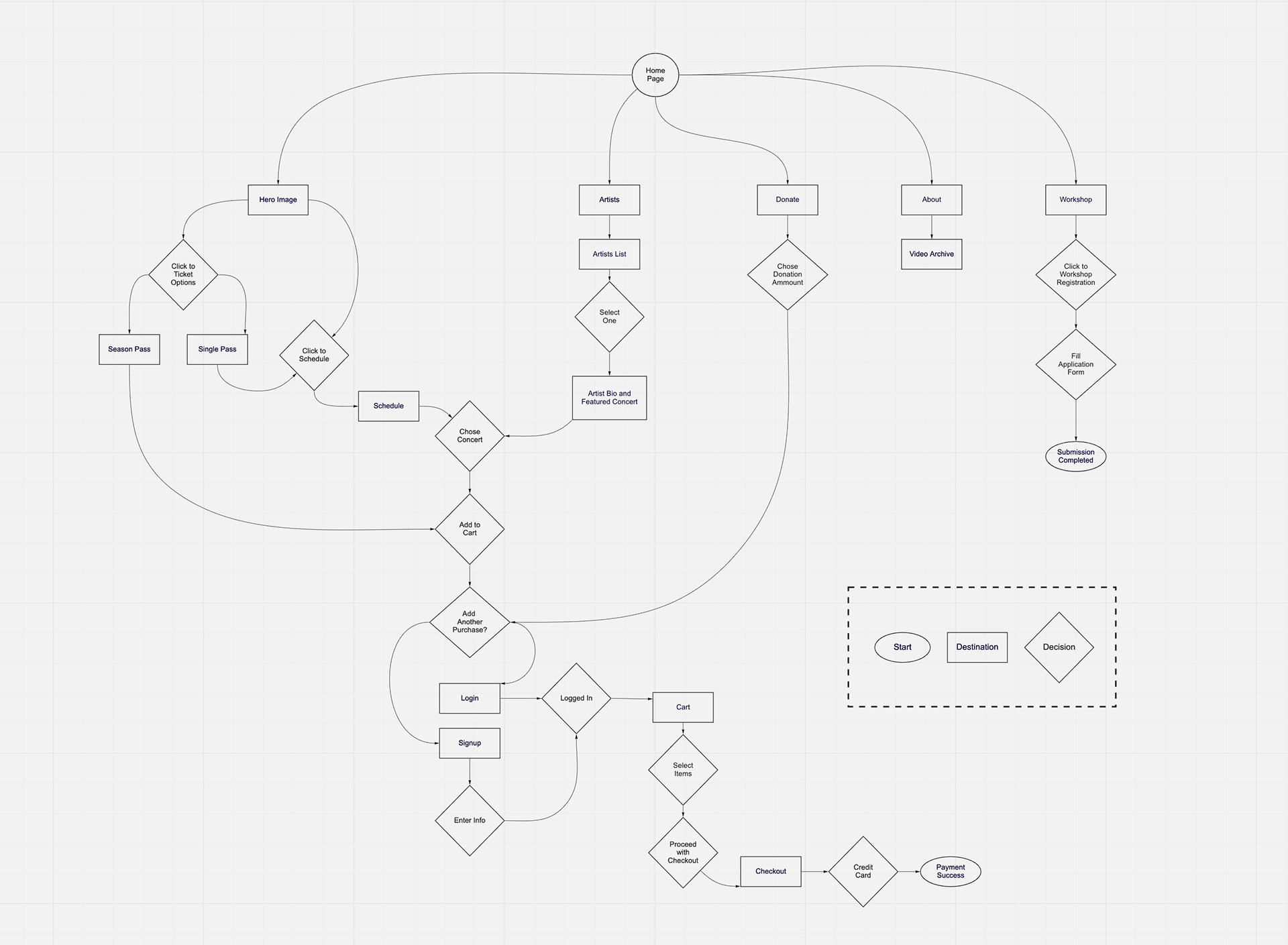
UX Flow
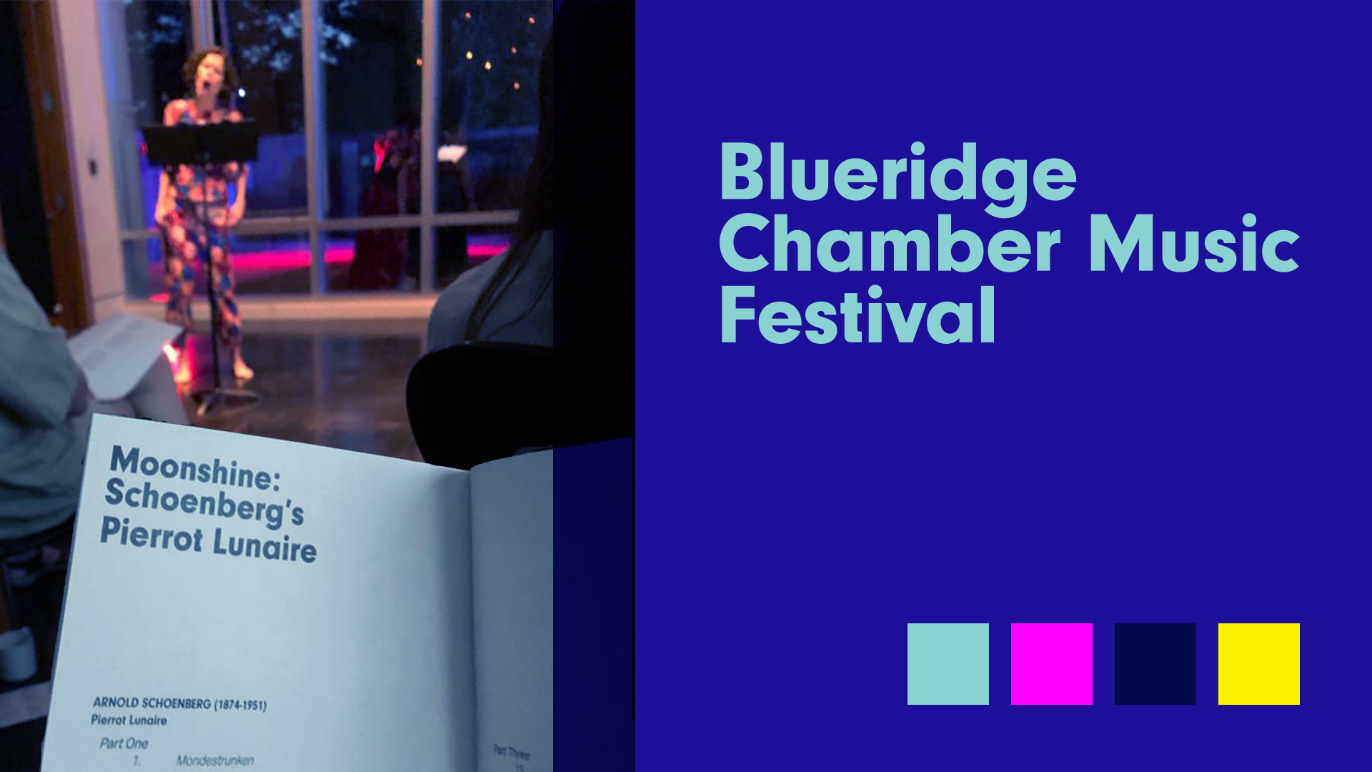
The Blueridge Brand
The logo is set in Neuzeit Grotesk, a typeface with fun and round contemporary features that communicate the innovative nature of the festival. When paired with a more humanistic typeface like Aktiv Grotesk (in booklets and posters) brings the contrasting tension of the classic and the contemporary coming together to create an unforgettable experience.
The colour palette has the contrast of the warm summer evenings in Vancouver, toned down by navy blue, a colour as legendary as chamber music.

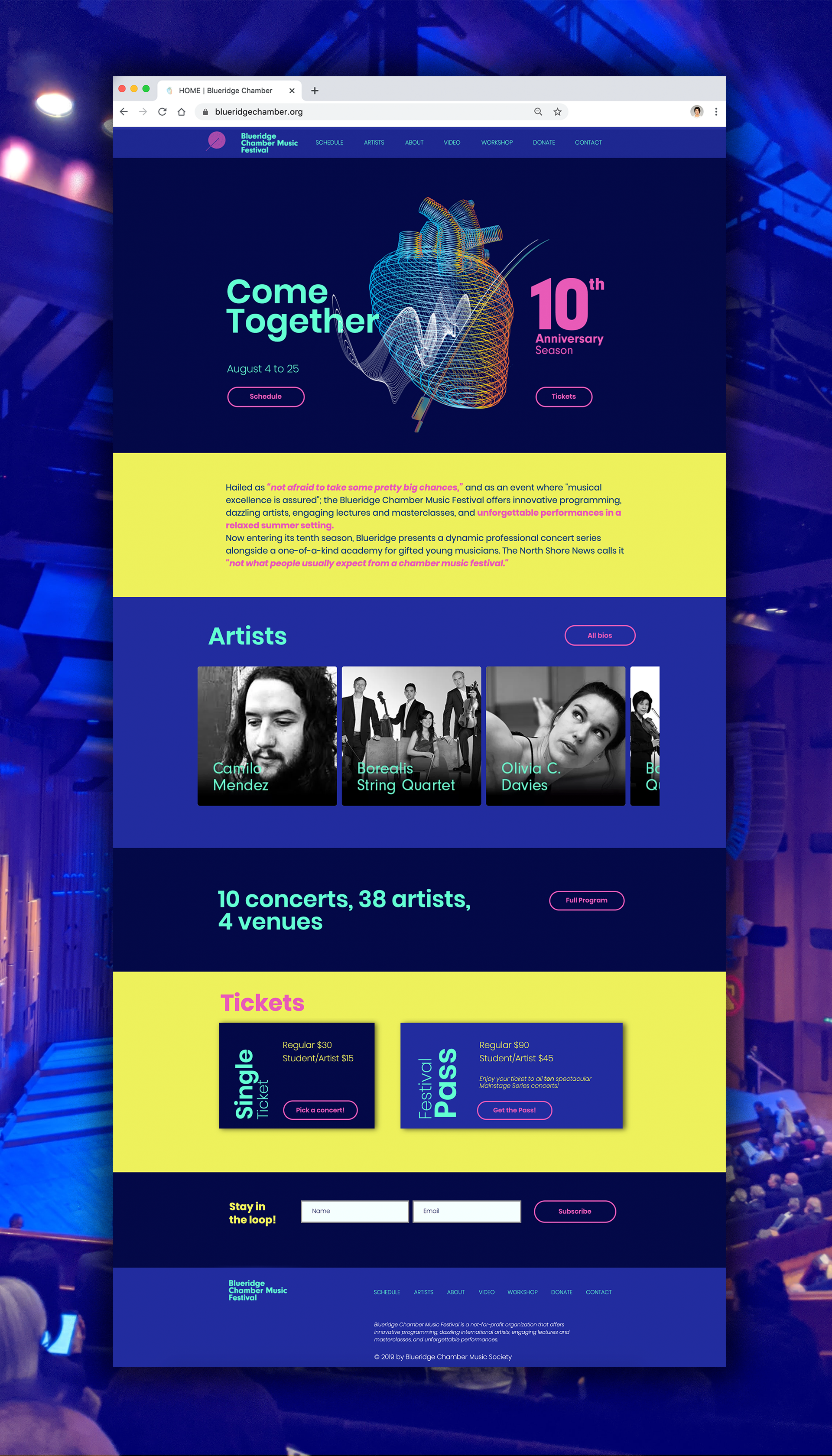
The New Website
Advertising and Merchandise
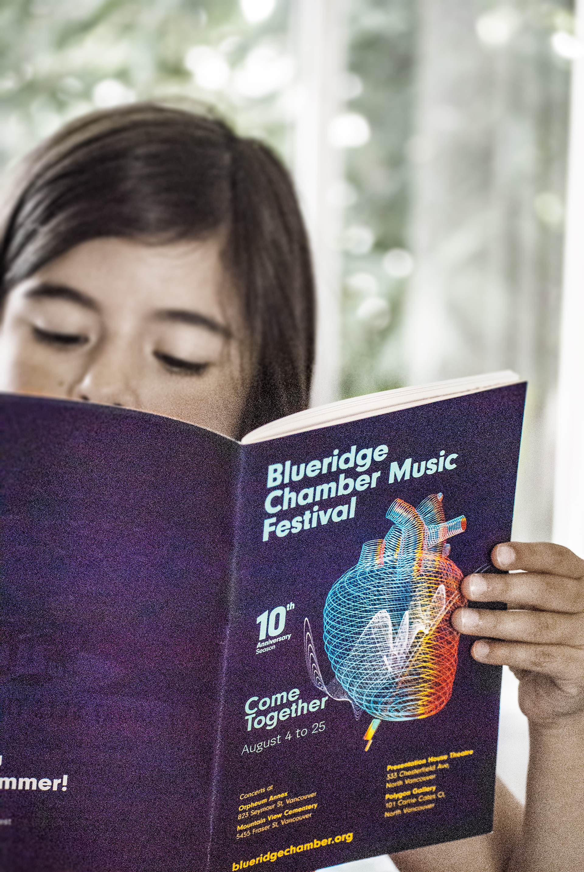
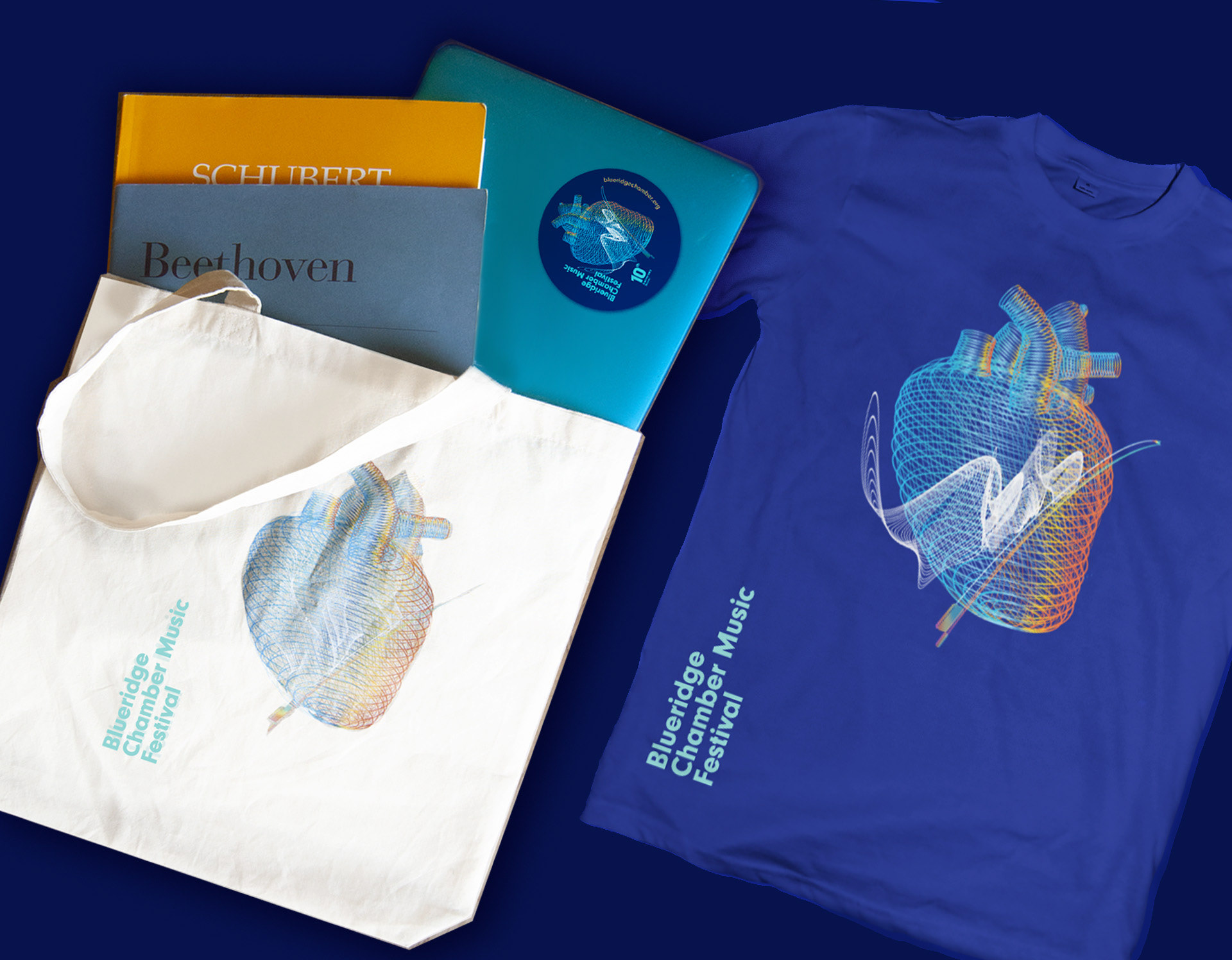
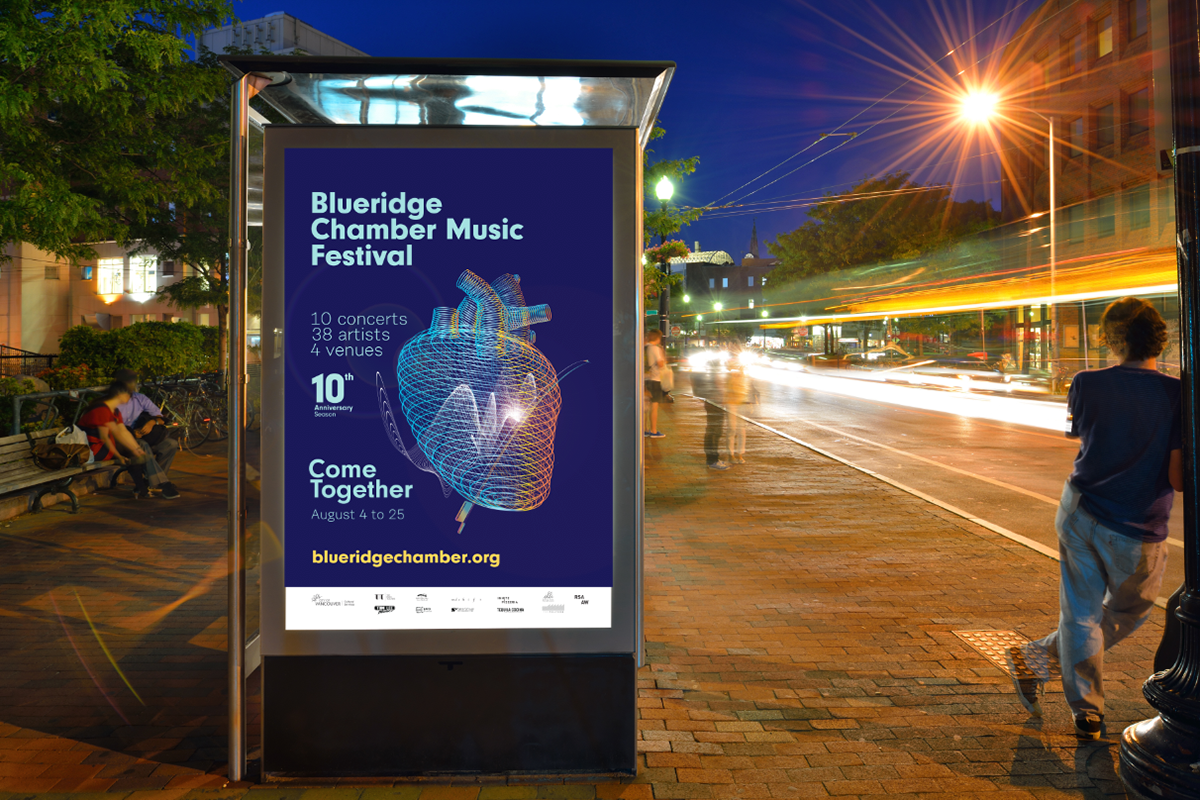
Over the last ten years, the Blueridge Chamber Music Festival has become a local institution, offering the finest in classical music programming and education. The new brand and website helped to establish recognition and to increase support from sponsors, tickets sales, and awareness of their chamber music workshop for young musicians.
Thanks for watching!